PlateMate Case Study
User interface app design that simplifies nutrition through personalized meal plans, grocery lists, and healthy recipes.
Project Type: Concept for Northwestern Graduate Program
Role: Solo UX Designer
Responsibilities: Problem Statement, Competitive Analysis, User Persona, Project Scope, Low-Fidelity Prototype, Design System, High-Fidelity Prototype, Usability Testing
Duration: January-March, 2025
Project Summary
The goal of this project was to develop an app that helps young adults establish and maintain healthy eating habits throughout their lives. Through competitive analysis and the creation of a user persona, I decided to design an app that enables users to create personalized weekly meal plans from a directory of healthy and easy-to-make recipes. Additionally, the app automatically generates and updates a grocery list each time users add recipes.
Through the design ideation process, which included low- to high-fidelity prototypes, feedback from my peers, and usability testing, I developed a final high-fidelity prototype with the following features: account creation, onboarding, tutorial, recipe search, recipe details, a weekly meal plan, a grocery list, and a rewards feature.
The Problem
Given the current high cost of living, a culture of intense and restrictive diets, and many companies requiring their employees to work long hours, it is increasingly difficult for many people to find the time to prepare and enjoy nutritious meals that promote good health. This challenge is particularly significant for young adults, who are starting their independent lives with limited knowledge of cooking and healthy eating. With this context in mind, the problem statement for this project was: “How might we help young adults develop healthy eating habits that they can maintain throughout their lives?”
Competitive Analysis
The goal of this competitive analysis was to gain a better understanding of the current market for nutrition apps. I aimed to identify what these apps do well, as well as the gaps and opportunities that exist for my app to stand out among competitors.
I researched three apps that focus on making healthy eating easier for users. Two of the apps, My Fitness Pal and Lifesum, focus on overall health but include specific nutrition-related features such as meal and nutrition tracking, recipes, and meal plans. The third app, Mealime, focuses exclusively on nutrition through recipes, meal plans, grocery lists, and grocery delivery services.
Main Takeaways
All the apps offer various options for personalization and customization, including selecting specific health goals, dietary preferences, and entering personal details.
The app designs were quite similar. They were modern, simple, and clean. This makes sense, since they all aim to simplify health and emphasize the importance of clean eating.
All the apps included an onboarding process where users answered questions to set up their profiles, health goals, and preferences. The onboarding process was straightforward, as was understanding the main features of the apps.
Opportunities to Differentiate PlateMate
Young adults have specific needs that are not being met by the apps I researched. To better address these needs, we could focus on offering cheaper food options, quicker and easier recipes, single-serving sizes, and recipes that require limited cookware.
Many apps are focused on specific goals and emphasize tracking health and nutrition. While this approach may be effective for some users, others might prefer a more enjoyable and casual app that doesn’t concentrate as much on precise goals or logging every meal.
Being part of a community can make it easier to achieve goals related to healthier eating. We could enhance community engagement in the app by allowing users to rate, review, and comment on recipes.
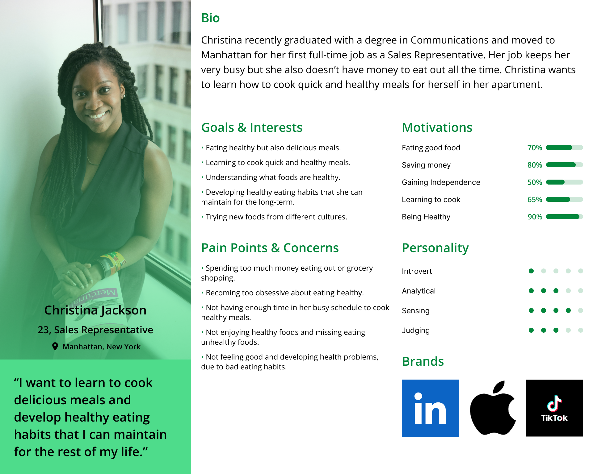
User Persona
I wanted to form a deeper understanding of my users' goals, needs, experiences, and behaviors. So, I created a persona based on my target user. I used this persona whenever I wanted to step out of myself and reconsider my initial ideas.
Low-Fidelity Prototypes
Using Figma, I created low-fidelity prototypes for three main features of the app. The low-fidelity nature of these designs enabled me to quickly conceptualize the user flow and the primary elements of the design without focusing on specific visual design aspects like typography, color, and images.
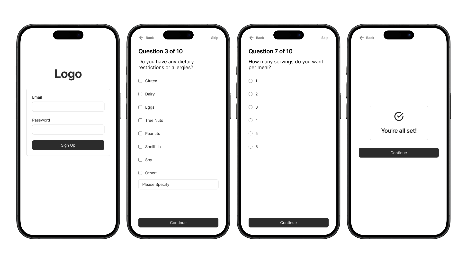
Onboarding Wireframes
The account creation and onboarding feature enable users to personalize their experience with the app by answering questions about their dietary restrictions and preferences.
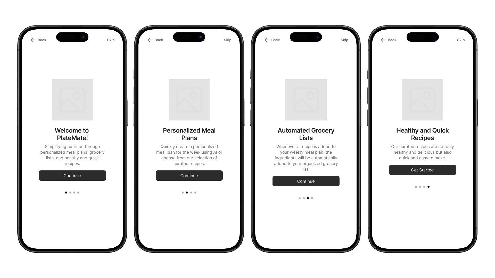
Tutorial Wireframes
The tutorial feature guides users through the main features of the app, ensuring they have a basic understanding of how it works.
Recipe Search Wireframes
The recipe search feature enable users to find recipes by entering specific search terms. Users can also filter recipes based on their dietary preferences and sort the results in various ways. By clicking on a recipe, users can view the full recipes and then add it to their meal plan.
Design System
After completing my low-fidelity prototypes, I decided to create a design system. This would allow me to easily generate high-fidelity designs using the components of the system, ensuring that all designs would feel cohesive. I wanted the designs to convey a modern, simple, youthful, bright, and fresh aesthetic, so I carefully selected colors, typography, and imagery that aligned with these branding attributes.
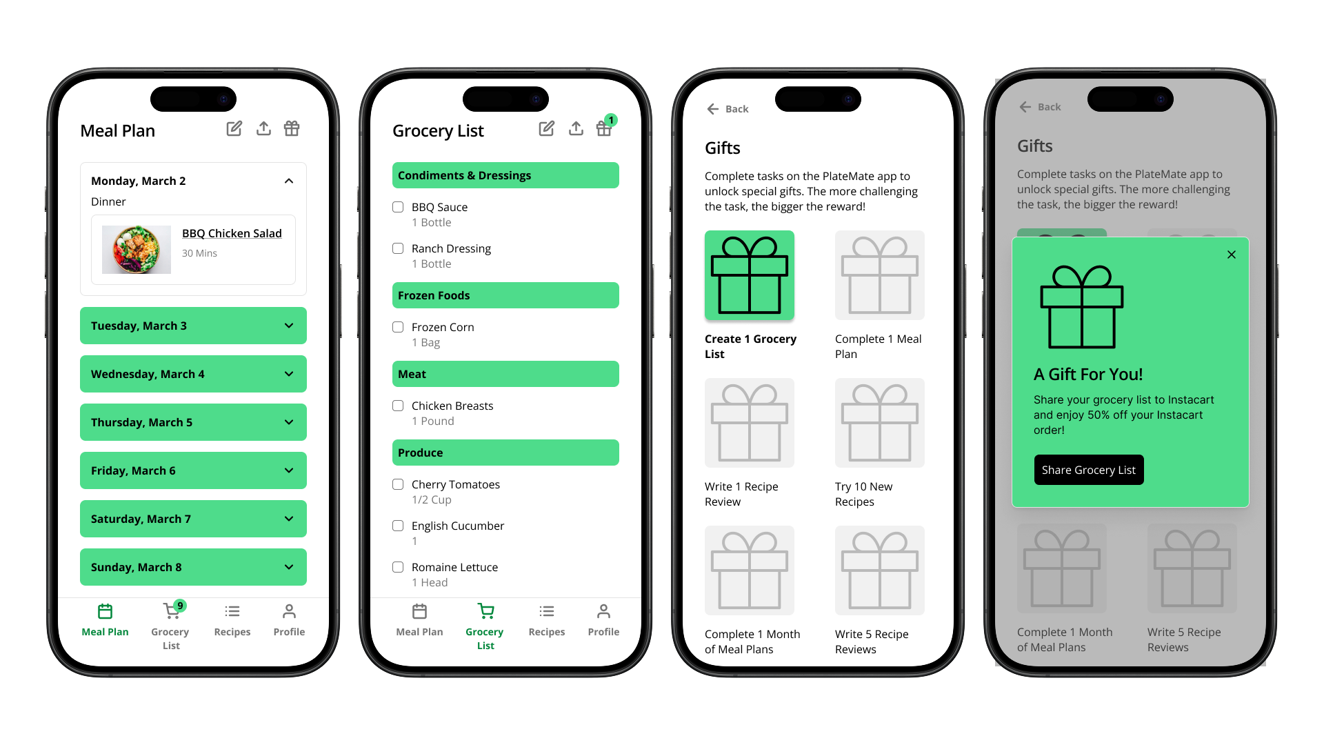
Desirability & Persuasion Prototype
After completing my design system, I decided to use it to add one final feature to my app. I aimed to incorporate the design principles of desirability and persuasion into this prototype. One concept I focused on, related to desirability, was notifications. I chose to implement notifications for two main purposes: to alert users when their grocery lists have been updated and to inform them when they have received a gift. Additionally, I incorporated the concept of rewards. In this case, users must complete specific tasks within the app to receive these gifts. I hope these features will motivate users to develop a habit of using the app, ultimately helping them eat healthier and improve their overall quality of life.
High-Fidelity Prototype
I then utilized my design system to create a high-fidelity prototype that included all the features I have designed so far. Based on feedback from my peers, I made several improvements to this prototype, including:
Adding a progress bar below the onboarding questions to provide users with a visual indication of their progress in the onboarding process.
Sorting the onboarding answer options and filter options alphabetically to help users easily find what ther’re looking for.
- Incorporating a stepper to simplify the process for users specifying how many servings they want per meal.
- Enhancing the tutorial by clearly highlighting the main navigation icons and explaining how they relate to the app's core features.
Usability Testing
I recruited five participants for usability testing and conducted remote sessions where they interacted with the prototype and attempted to complete six specific tasks. Overall, participants found the tasks easy to complete, rating most of them a 1 or 2 out of 10 in terms of difficulty. However, I did identify five areas for improvement in the prototype based on the participants’ feedback.
Reflection
This project really taught me the importance of creating and utilizing a design system. It was my first experience in both developing and applying a design system for a project. Having the ability to incorporate components from the design system into my high-fidelity designs was incredibly helpful, especially since I could easily modify those components if necessary. It also contributed to making the designs appear more cohesive and professional. Moving forward, I will definitely continue to use design systems in all my projects.
One of the biggest challenges with this project was finding the right balance between personalization and simplicity. For features like onboarding and recipe search, I aimed to make it easy for users to input and filter their specific dietary preferences and restrictions. However, I also wanted to ensure that users did not feel overwhelmed by too many options. In the end, I believe I successfully provided enough choices for users without making them feel inundated with options.
One thing I would have done differently with this project is to spend more time on user research. Since this project was for a User Interface class, the interface design was the main focus, and I was also constrained by a limited timeframe. However, if I had more time, I definitely would have conducted user interviews or surveys to engage with actual users and validate my assumptions about their needs and pain points.


